Top Digital Marketing and SEO Services in Kansas City: Your Go-To Agency for Web Design, WordPress, and Custom Solutions
In our last blog, we discussed three of the worst mistakes a company can make when creating a custom website in Pensacola that’s mobile-friendly. Well, if you thought there were only three mistakes that could be made when designing a website, you’re seriously mistaken.
We discussed the importance of the pinch and zoom feature, font sizes, and having a responsive mobile site. This blog will feature three more common errors that your Pensacola website design company must avoid to give readers the best browsing experience possible. These include:
- Issues with the Mobile Site’s ‘Search’ Function
- Buttons on the Site are the Wrong Size
- Unoptimized Menu on the Site
Issues with the Mobile Site’s ‘Search’ Function
As a leading SEO company in Pensacola, our team at Social: Managed. knows how critical Google searches are when looking for something on the web. To a lesser extent, a search tool is also a pivotal component of any website, especially a mobile site. Since mobile sites are more compact than desktop versions, it’s not as easy to see where everything is located. Thus, making a search bar an important feature.
Search bars help readers skip the unnecessary content and quickly find exactly what they need. Make sure your Pensacola web design company makes the search bar prominent and easily accessible on your company’s mobile web page.

Buttons on the Site are the Wrong Size
One item that often gets overlooked when converting a desktop site to a mobile site is the button size. It is important that your custom website in Pensacola has buttons that are sized to fit the average person’s finger.
Remember, mobile users don’t have the luxury of navigating with a mouse, which can click a very tiny area. Fingers are not as accurate and cover a much larger area. Make sure your Pensacola website design team considers this when creating your mobile site.
Unoptimized Menu on the Site
Anyone who is navigating a website will want to find what they’re looking for as soon as possible. One way to make the reader’s experience much more simplified is by having an organized menu at the top of your mobile site. A good menu can be the difference between a sale or the reader leaving your site.
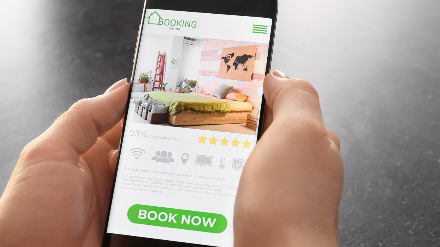
The menu icon is often referred to as the “hamburger menu” because its three lines resemble two bun slices and a patty. When readers see this, they immediately know where to go on your site to find a specific page. By clicking on the menu icon, it opens all the different pages that are offered on your site. If your site does not include a menu icon, expect readers to get frustrated and move on to one of your competitor’s sites.

At Social: Managed., our job is to help your business thrive. We’ll focus on many aspects of your business that you just don’t have the time to manage. Our team specializes in digital marketing, web design, social media, and we’re also considered one of the best Pensacola SEO companies. Let us show you how we can take your business to the next level!
Give us a call today at (866) 324-9700, or contact us online for more information. We can’t wait to work with you!


